Showing posts with label PIQF '10. Show all posts

Sunday, October 24, 2010

Last of PIQF 2010 10-24-10

Again, a big THANK YOU to my friend Mary Leakey for taking pictures at PIQF '20 when I could not travel up to Santa Clara due to bronchitis. These are just a few last images that she shared me with.... and you.
Mary and her grandgirls are fond of fairies, so it isn't surprising that she took pictures of this quilt from the UK. When I stay with Mary I get to sleep in the 'little girls room' and feel the protection of the many fairies around the room.

It is so sad that this quilt was folded face-in across the width creating an ugly crease. BOOO.

The see-through wings are a nice touch.


With the traditional log cabin blocks and the rich, dark colors this looks to me like a quilt from the 1880s in the USA.

And the fabrics look much like the silks of that era. Nice quilt.


I wish there were more of an explanation on this quilt. Why pockets? Interesting colors.


A very interesting quilt. The fact that the background is whole cloth with layers of hand printed motifs and then applied with clear 'raindrops' gives the quilt an unexpected depth.

Posted by Picasa

Saturday, October 23, 2010

PIQF - Foliage 10-23-10

The focus of these quilts is foliage - some critters are also here.

Noriko's distinctive technique creates beautiful woods and orchards. She has a special affinity for this type of quilt, each one she makes is a masterpiece.


Although this amazing frog lives among the lily pads and plops into very green water, I think the uneven edge is a distraction. Perhaps it would show better on a wall than on a curtain.


Betty has a different eye for color and and used it effectively in this unusually colored quilt.
There was another "Monstera" quilt in the show, but I don't know the maker and will not show a quilt without a name. After all the work that goes into a quilt, the artist deserves identity.


This quilt, also made by Betty Busby, was in the World Quilt Competition representing the USA. Again, her color sense is distinctive and eye catching. The water is especially wonderful.

There are many critters in this quilt. If you click on the all-over image you can see them better.

Posted by Picasa

Friday, October 22, 2010

More PIQF - People 10-22-10

It seems that every art quilter turns eventually to depicting people or animals. Here are a few people quilts that were on display at PIQF 2010. By-the-way, anytime there is a country flag on a sign it indicates that the quilt represents that country in the World Quilt Competition.
Quilts that are displayed in the special exhibit New Quilts of Northern California may also be entered in the competition part of the show. So, they have two labels - I include both because the information is slightly different.

I imagine any grandmother would be thrilled with this quilt. The shadows are especially nice.

Wonderful whimsical display of the people who could live on my block, or yours!

Isn't the "Vote for Big Void for Governor" a hoot? This being "the year" for California it seems so appropriate.

There is always someone who cannot have enough pets.


Pamela Allen is one of my favorite quiltmakers and there are several of her quilts in the TCQG. I also found her class at Asilomar very instructive and fun - I accomplished a lot that week. Always good to have a teacher who gets you going and shares all of her methods and secrets.

I'm not sure that the Hilton would actually allow these ladies in their lounge. Spools into boobies is one of Pamela's extra touches.

I can't figure out what this lady's hair is made of. It looks like a row of little mice - with feet!

Posted by Picasa

Thursday, October 21, 2010

More PIQF - Trees 10-21-10

I've been a 'tree hugger' all my life - even before there was a name for such an addiction. When quilts were selected for an exhibit from the Thomas Contemporary Quilt Collection they were able to fill one small gallery with just tree quilts. I was amazed. Here are a few tree quilts from PIQF -2010.
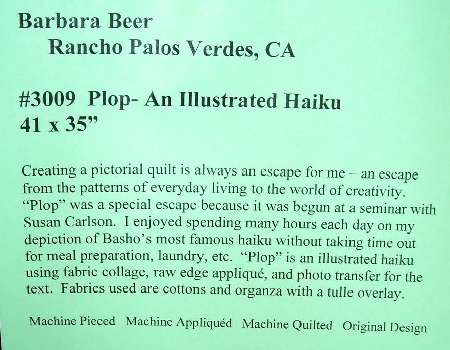
Sorry this is such a poor image of the label on this wonderful quilt - I doctored it as much as I could.


Barbara has used tulle to create shading and (I think) beads to give some sparkle.


This is an interesting quilt - she has used just about every technique she knew to embellish it. Dijanne Cevaal of Australia and Europe has used the bleaching process to create trees for a decade or so. "Forest II" in the TCQC is on my blog at
http://delquilts.blogspot.com/2008/09/quilts-from-tcqg-09-23-08.html


A wonderful abstraction of a bamboo grove.


Here is another abstraction - this one of a forest renewal after fire. So beautiful.


I've noticed that many of the blogs with pictures of PIQF '10 include this lovely quilt - aspens are high up on my list. It seems to me that each year there are more quilts created in this format - like snapshots in an album.
Posted by Picasa

Wednesday, October 20, 2010

More PIQF Looks familiar 10-20-10

Sometimes I look through a quilt show and make connections with other quilts or with quilts from the past - it is a challenge to try to guess who made the quilt based on those quilts from the past. Sometimes I'm right and sometimes I am wrong - I think of it as brain exercise.
This is a triptych, a form that seems to be used more in Europe than the U.S. I guessed wrong on this one. But blue and yellow always speak to me and I think this quilt is gorgeous.


I can sometimes pick out a Carol Taylor quilt, but I would not have thought this was hers except that I had seen it before. I admire Carol's flexibility - she continues to explore and try new directions. She is amazingly productive considering that she teaches all over the world and also serves as a member of the Board for Studio Art Quilt Associates.


See what I mean about Carol? Here is an entirely different style and technique. She has gone in many directions with piecing strips and this one is a knockout. Apparently there was some discussion among some viewers about whether this quilt was pieced or appliqued - don't they read the signs?


I was wrong on this one also. But I excuse myself because it is a basic design that has been explored by many quiltmakers over the last (at least) twenty years. I like this quilt because it is RED and because it is free cut, giving it a texture not found in a symmetrical version.


Posted by Picasa